This year I started an Interaction Design at Sheridan College. It’s been amazing and I’m very happy with the program and the school. It’s a four years Honours Bachelor degree so I’m going to be pretty good and smart after I finish! 😉
Meanwhile, I’d like to post some of my projects and process work for my school assignments. I hope you find them interesting!
So here’s the first one (drum roll!) :
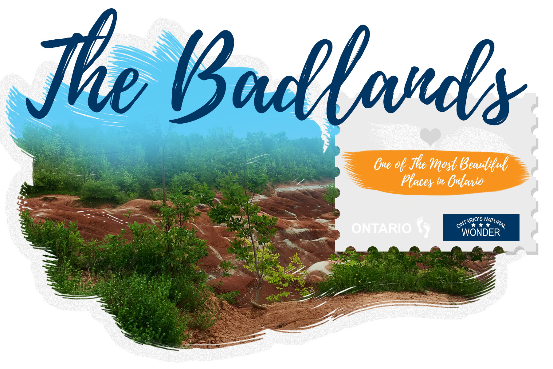
POSTCARD DESIGN
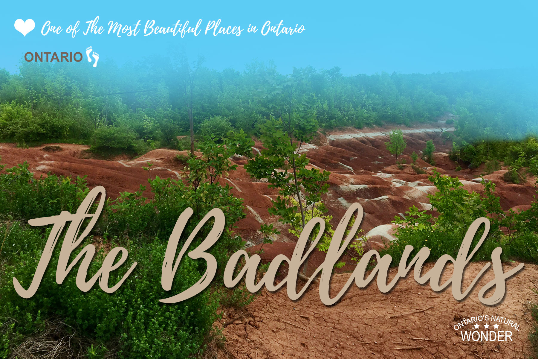
For this project I’ve decided to use photos of Badlands I took in the summer of 2015 with my iPhone6 camera.
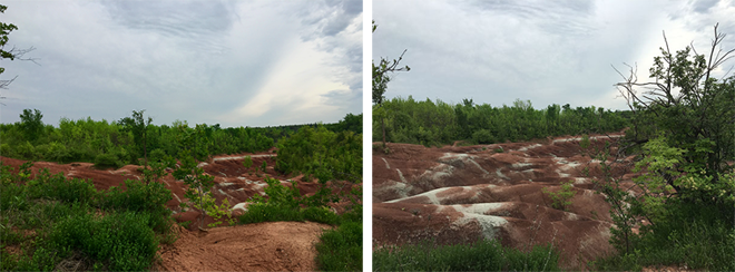
The photos were a bit washed out so I used Photoshop to correct saturation, vibrancy, brightness and contrast of the photo I liked the best. I used High Pass filter to sharpen a photo as well.
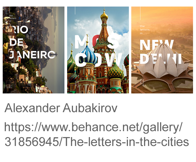
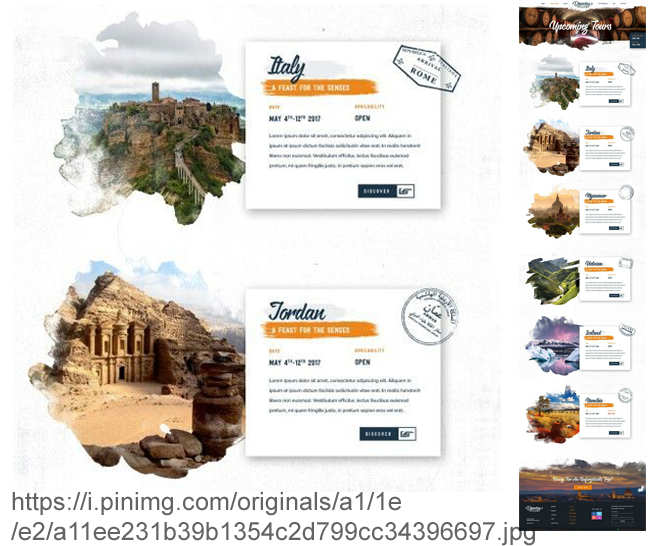
For the next postcard design I’ve decided to try to use that interesting effect I’ve seen on this postcard:
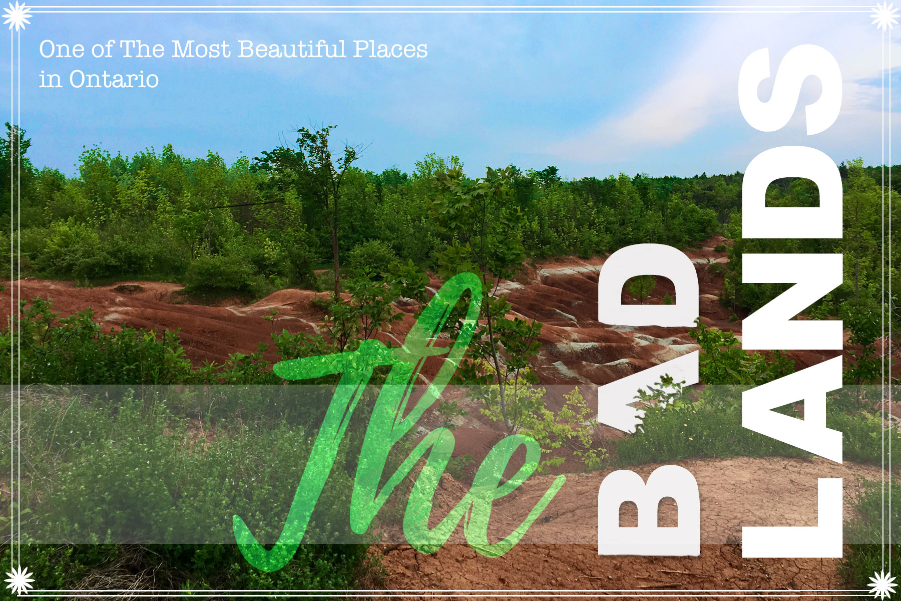
A) Unfortunately the photo I took has not enough depth to make it work, so after trying couple of letters I’ve decided to abandon the idea, although I still love it and I would like to try it again in the future. I think failure of this design is in the lack of… color. Somehow after improving a photo and adding saturation and vibrancy I still don’t like the colors. Something is quite not right here yet.
B) Here I just tried to apply background image to type, but the effect didn’t look in anyway appealing and it didn’t make sense to use a different photo. Through masking I’ve added more blue color to the sky. It looks better, but it’s not yet what I want.
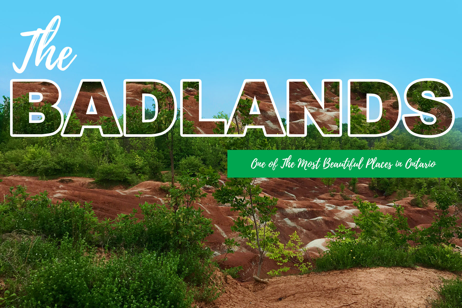
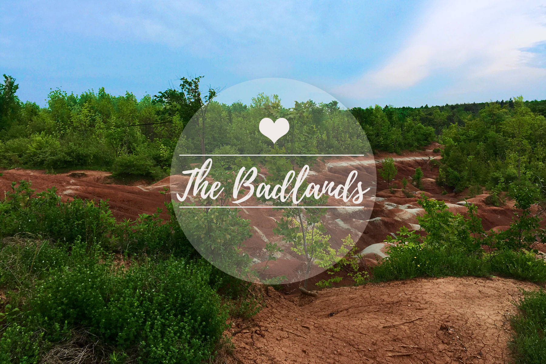
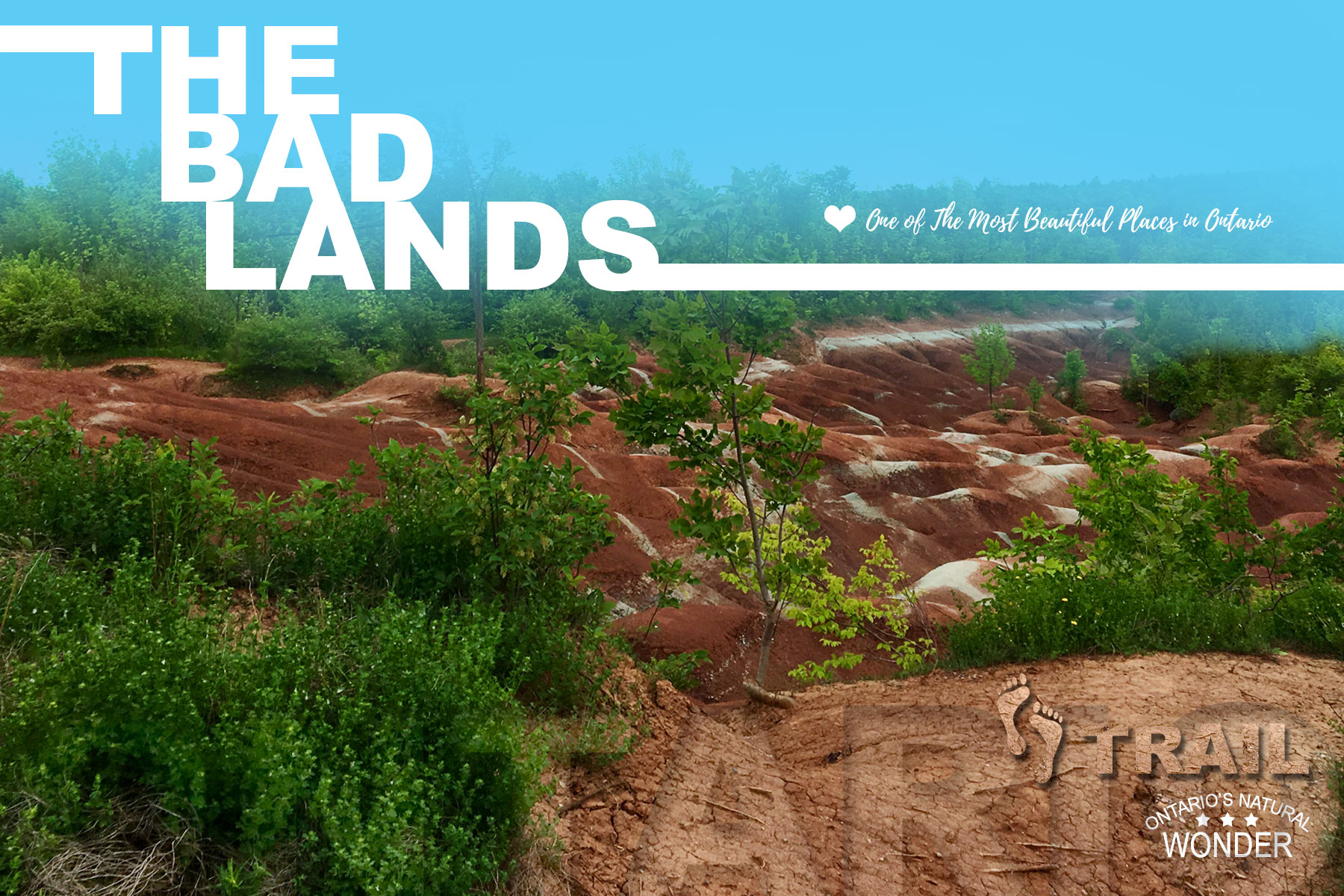
For the design below I was trying to apply the rule of thirds and Gestalt principle of continuity. I wanted the eyes of the viewer to be led from the top left corner to the bottom right corner.
I would say this artwork was an inspiration behind the lines in this design:
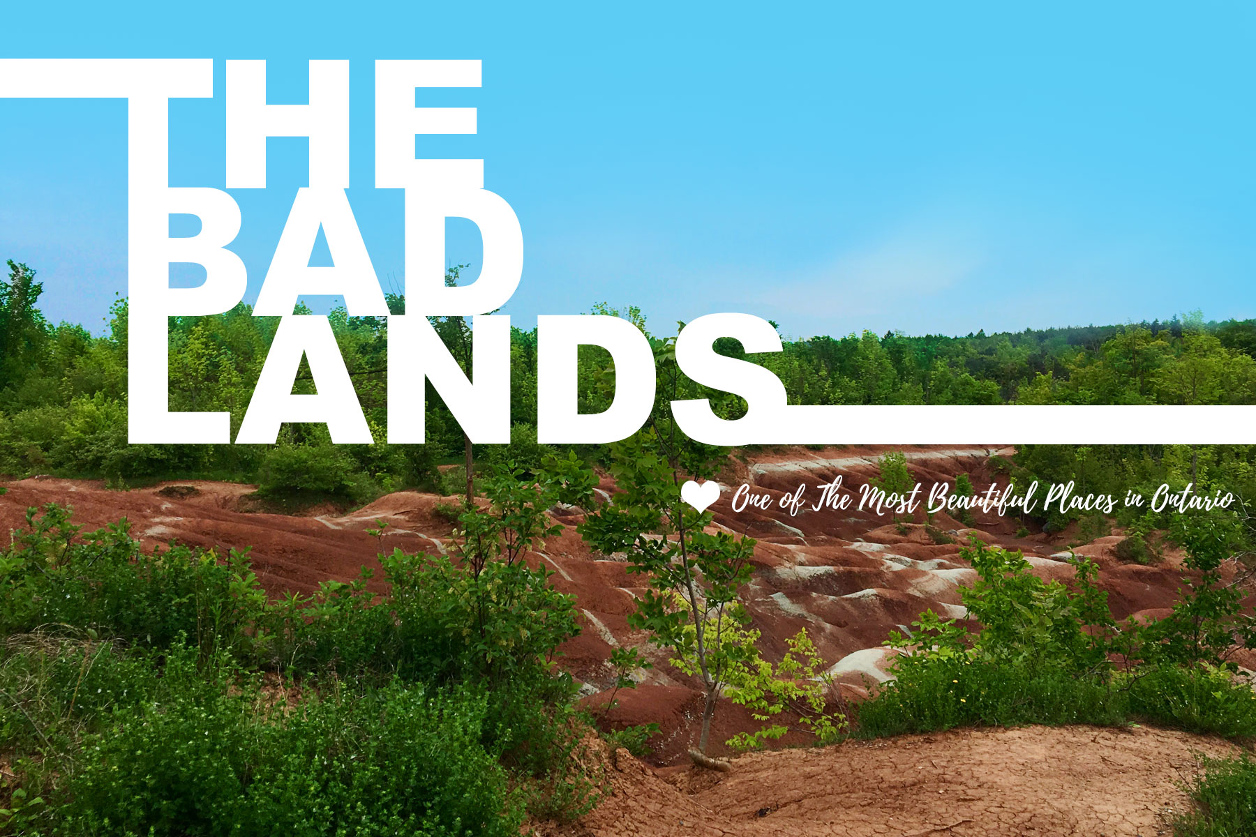
Finally I’ve got it! The sky! I’ve applied a blue color to the layer and then brushed out the bigger part of it leaving only the top. I like how the color works nicely with the redness of the land and resembles sort of a blue fog. I’ve applied texture to the footprints and text.
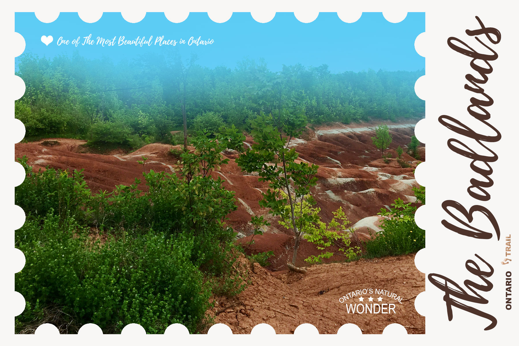
Here’s something I just had to try to recreate:
I’ve never really used a brush in a kind of random way to create this feeling of a painted image. It was fun to do and it was fun to explore the way it was done.