How important really is it?
Kurt Koffka, the gestalt psychologist summarized it like this: “The whole is other than the sum of the parts.”
The gestalt laws are especially important in user interface design because they help to create more intuitive human use. The example would be placing navigation buttons together – that is a law of proximity and similarity.
Understanding that an eye perceives things as whole rather than parts (single elements) allows to create better designs.
Gestalt Principles:
The Law of proximity
The Law of similarity of:
- color
- size
- orientation
- texture
- typefont
- etc.closure
The Law of symmetry
The Law of closure
The Law of parallelism
The Law of closure
The Law of common region
The Law of common fate:
- synchrony
Contrasting Relationships:
Scale
Movement and direction
Space: depth/position
Texture
Pattern
Frequency/Rhythm
*Look below for visual examples
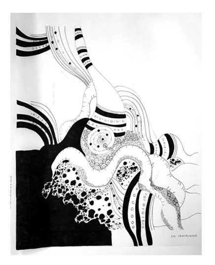
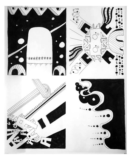
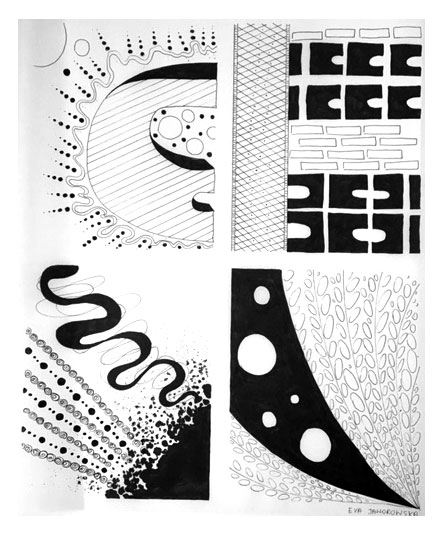
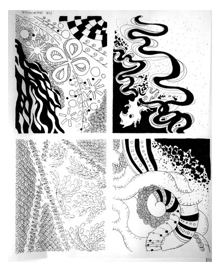
Using only shapes like circles, squares and triangles I’ve tried to demonstrate a contrast between the relationship of Scale, Movement and Direction, Space, Texture, Pattern and Frequency and Rhythm.
I used Adobe Illustrator to demonstrate the above relationships.
My two best pieces are the ones representing space: spiky square and high-risers. I think they are visually effective in their representation of texture (the square) and depth of field (high-risers). And I really like the process behind them – how I was able to test them with quick, messy drawings and have them emerge into a better pieces then the initial idea.
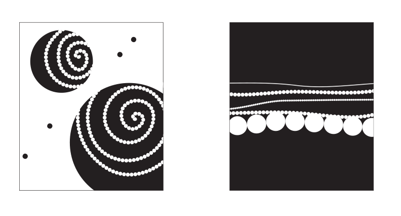
Movement & Direction
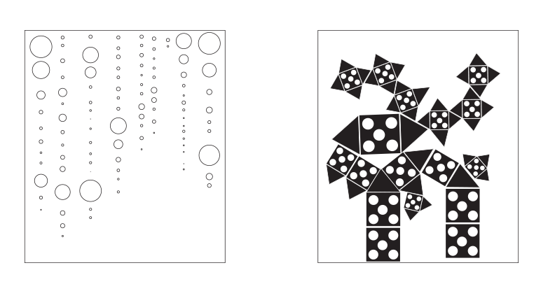
Frequency & Rhythm
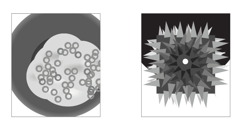
Texture
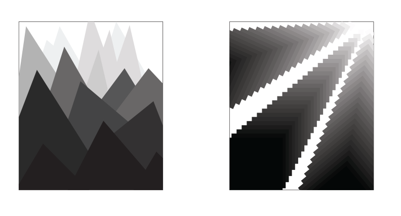
Space
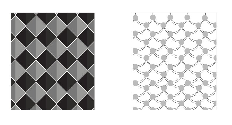
Pattern
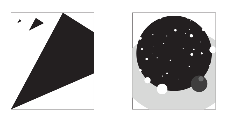
Space

